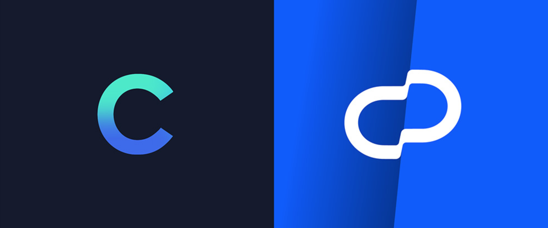
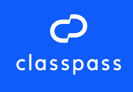
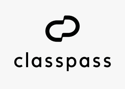
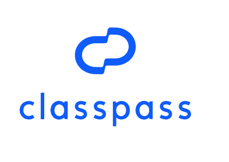
Former branding on the left, current on the right
ClassPass wanted to differentiate itself in the fitness industry.
The fast-growing fitness brand wanted to showcase its empathy as a breath of fresh air in the overly intense fitness scene. I worked with an in-house team of designers and creative directors to create a brand new look and feel that matched the approachability they wanted.
The result? A new logo and typeface, updated colors, and a brand voice update.
They all highlighted progress over perfection, revealed shortly after ClassPass’ 5th birthday. Adweek picked up on the hype, calling our clean, bold look the beginning of a new era. And it sparked a conversation on BrandNew, generating positive feedback overall.
“Overall, this is a cool evolution that gives the company and its audience something with more personality and recognizability.”

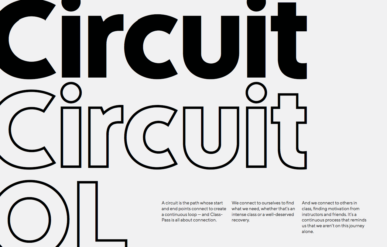
My writeup for Circuit, ClassPass’ custom typeface, as featured in Adweek
My role through all of this?
Concepted. I collaborated on the look and feel of the new brand, from logo to wordmark, custom type-face and more.
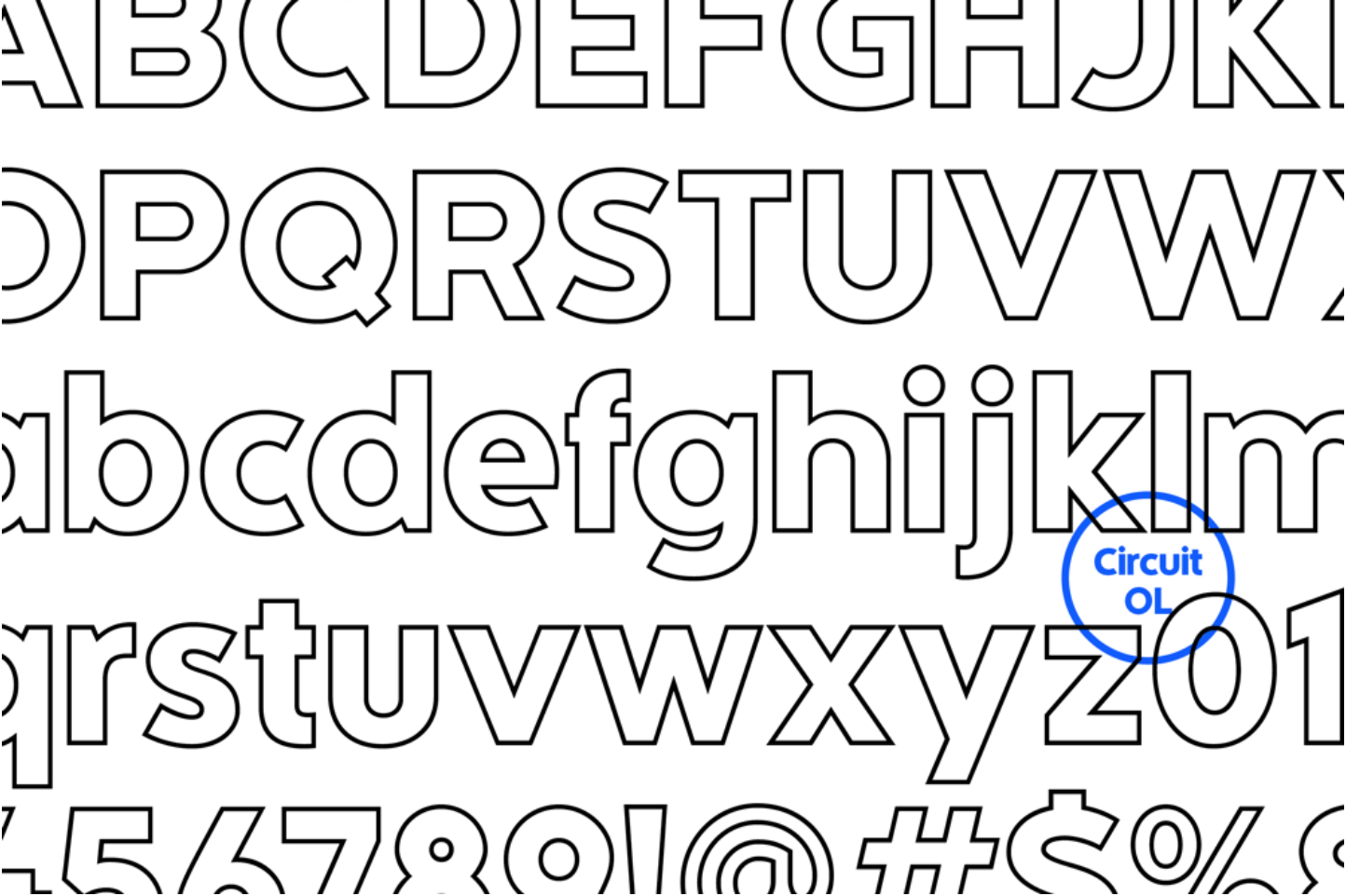
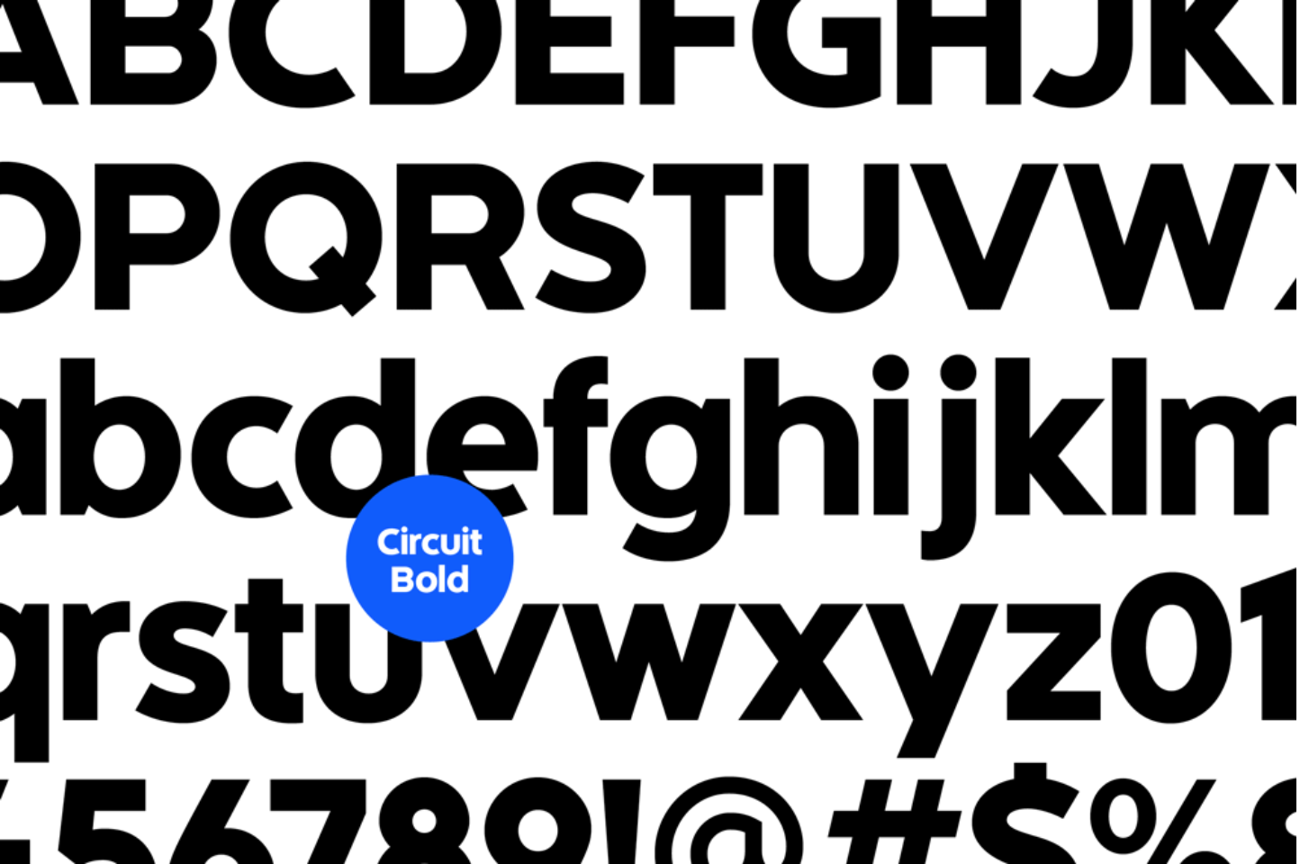
Named our custom typeface, Circuit. After pages and pages of options, ClassPass settled on a name that highlighted connection and progress.
Developed brand voice guidelines. I wrote the (internal) book on all things copy, from how ClassPass wants its members to feel, to on-brand usage of the em dash.